Structure
General Content Structure
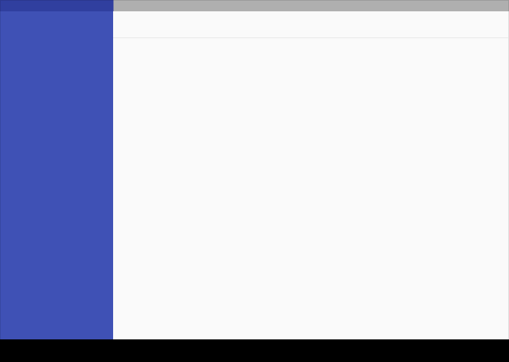
All content components by default are managed by page theme. You can edit content on each individual page as well..jpg)
General Content Structure
Primary toolbar - top toolbar menu starts from PaperFree ThemesBackground - all page central page background
Secondary toolbar - page's header box starts from PaperFree Themes
Layer #1 of color for Secondary toolbar; between layer#2 and Secondary toolbar, starts from PaperFree Themes
Content canvas - central page's content
Layer #2 all components and background, starts from PaperFree Themes
Bottom Bar - page footer starts from PaperFree Themes
UI regions
Mobile structure
This structure includes a permanent site/app/tool bar and floating action button. An optional bottom bar can be added for additional functionality or action overflow. Side nav menus overlay all other structural elements.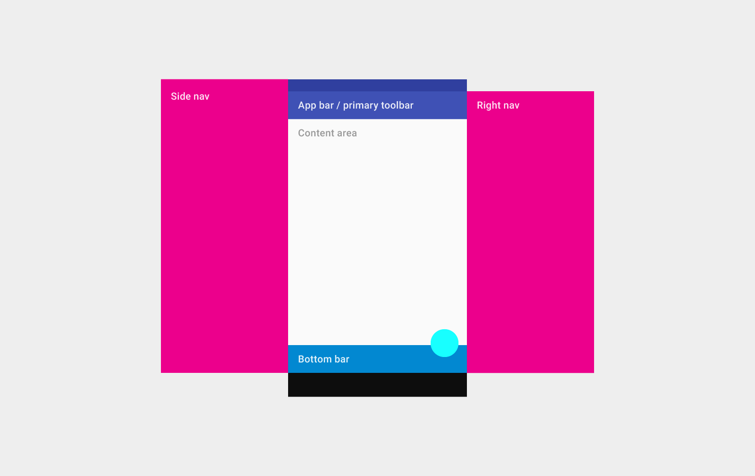
Mobile structure
Top left to right: Side nav, app bar/primary toolbar, content area (below the app bar/primary toolbar), and right navOn the bottom: bottom bar
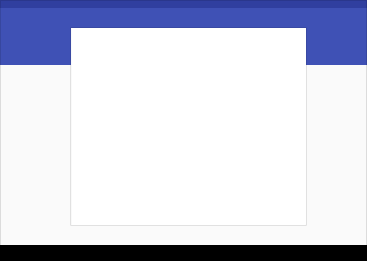
Tablet structure
This structure shows a permanent app bar with a floating action button. The app bar absorbs elements from the tablet and mobile bottom bars. An optional bottom bar can be added for additional functionality or action overflow. A side nav overlays all other structural elements. A right nav menu can be accessed temporarily or pinned for permanent display.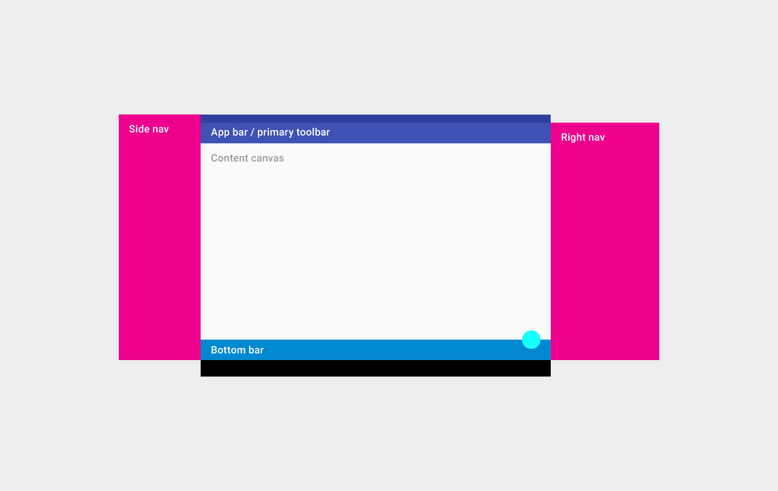
Tablet structure
Top left to right: Side nav, app bar/primary toolbar, content canvas (below the app bar/primary toolbar), and right navOn the bottom: bottom bar
Desktop structure
The desktop structure contains a permanent app bar with a floating action button. The app bar absorbs elements from the tablet and mobile bottom bars. Where possible, the window controls are absorbed into the app bar.Side navigation menus can take up the full height of the screen size (including under the app bar) and be accessed temporarily or pinned for permanent display. Side nav menus, as well as the content canvas, can have their own secondary toolbars for tabs, palettes, or secondary actions.
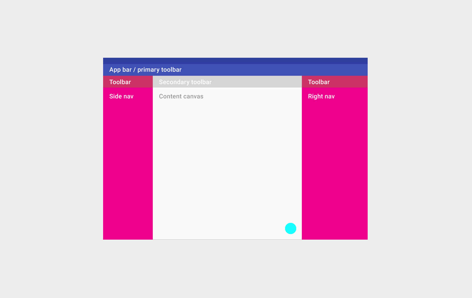
Desktop structure
Top left to right: App bar/primary toolbarSecond row from left to right: Toolbar, secondary toolbar, and toolbar
Third row from left to right: side nav, content canvas, and right nav
On the bottom: floating action button
UI regions
Define a primary horizontal or vertical divider.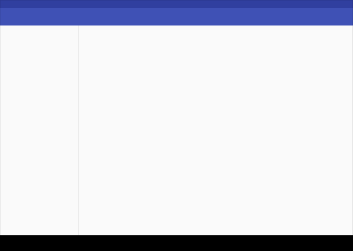
Vertical divider
Horizontal divider
Break edges with cards and floating action buttons.
Card breaking an edge
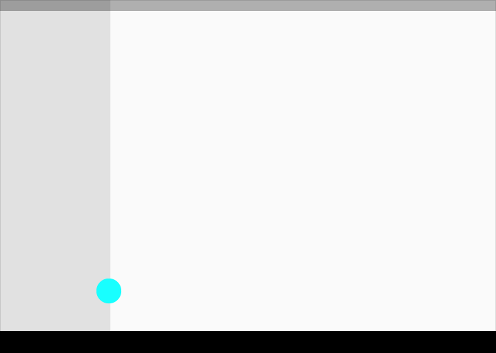
Floating action button breaking an edge
Cards
Use cards to:1) organize content when specific behaviors are needed
2) groupings of information need more separation than what whitespace or dividers can provide.
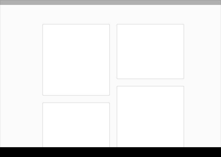
Cards
Cards
PaperFree.com is the most flexible business management system, a set of software: Customer Relationship Management, Enterprise Content Management System and more serving the entire U.S., including the cities of New York, Los Angeles, Chicago, Dallas, Seattle, Miami, Tampa, Phoenix, Cleveland and San Francisco as well as Fairfield County, CT, Westchester County, NY and Rockland County, NY.
Copyright © 2019 PaperFree.com Inc. All rights reserved and data products are owned and distributed by PaperFree.com Inc. and its subsidiaries. | About | Feedback | All Contacts | ID: 979-446-8934 S/N 78675-0 | SID 487999-3 | Version 3.2 Powered by PaperFree.com | Legal